


Why Mobile Shoppers Leave Your WooCommerce Cart (A 30-Minute Audit You Can Run on Your Phone)
Open your store on your phone, add something to the cart, and try to buy it. Stand up, use one thumb, and let a notification interrupt you halfway through, because that’s how plenty of your customers shop. It’s a quick way to find problems your analytics won’t show you.
This is a 12-check audit that follows the shopper’s path from the add to cart button to the payment step. It takes about 30 minutes, you don’t need a developer, and at the end you’ll know what to fix first.
Why shoppers abandon carts, and which reasons you can fix
Baymard Institute’s cart abandonment list puts the average documented rate at 70.22%, based on 50 studies. That sounds grim, but Baymard also found that 42% of US online shoppers had abandoned a cart because they were “just browsing / not ready to buy.” You can’t fix that group, and you shouldn’t try.
Set the browsers aside and Baymard’s survey of the remaining reasons looks like this:
- Extra costs were too high (shipping, tax, fees): 40%
- Delivery was too slow: 20%
- They didn’t trust the site with their credit card information: 19%
- The site wanted them to create an account: 18%
- The checkout was too long or complicated: 17%
- The site had errors or crashed: 17%
Shoppers could give more than one reason, so the percentages overlap. Most of these are in your hands: what you show before checkout, how many fields you ask for, whether you force an account, how errors behave. The audit below is built around them. Delivery speed is a business decision, so it’s outside the scope here.
Set up the test
Use a private browser tab so you’re logged out with an empty cart. If you can, test on mobile data instead of your office Wi-Fi, which hides slow loads. Pick a variable product, such as a shirt with size and color, because those are the hardest to get right. Ship it to an address outside your own city so the shipping calculation is real. Keep a notes app open, or record your screen, and write down every moment you hesitate.
If you have both an iPhone and an Android phone, run the checkout once on each.
Part 1: product page and add to cart
1. Can you choose a variation with one thumb?
Pick a size and a color, and count the taps. Watch for dropdowns that take three taps to open and close, out of stock options that only reveal themselves at the end, and prices that don’t change when you choose. If your catalog has lots of colors and sizes, our guide to making a store with many colors and sizes easier to browse covers the options.
2. Does the add to cart button tell you it worked?
Tap it and watch. Does the page jump back to the top? Does a tiny cart counter change somewhere you didn’t look? A button that gives no sign it worked invites a second tap, and then there are two in the cart.
WooCommerce has two settings that affect this, both under WooCommerce > Settings > Products. One redirects the customer to the cart page after a successful addition. The other, “Enable Ajax add to cart buttons on archives,” adds the item without reloading the page. Redirecting makes sense if most customers buy one thing. If they browse and buy several, sending them away from the shop after every tap usually slows them down.
3. Are the tap targets big enough?
WCAG 2.2 success criterion 2.5.8 asks for pointer targets of at least 24 by 24 CSS pixels, with an exception for smaller targets that have enough space around them. The W3C’s explanation says the point is to let people activate a target without hitting its neighbor by accident. That’s a minimum, so aim bigger where you have room.
Check the quantity plus and minus buttons, the small “×” that removes a cart item, swatches, and the close button on any popup. If you hit the wrong one twice, your customers will too.

4. How much screen is left after everything loads?
Cookie banner, chat bubble, sticky header, newsletter popup, sticky add to cart bar. Each one makes sense alone. Stacked on a phone, they can squeeze the product photo and the buy button into a quarter of the screen. Load a product page fresh and see what’s left. If you can’t reach the button without dismissing two things, remove one of them.
Part 2: the cart
5. Can shoppers get to the cart and get back out?
From a product page, the cart should be one clear tap away. From the cart, going back to shopping shouldn’t dump you at the top of the shop with your place lost. If the cart is a separate page, the loop of product, cart, back, and find your place again is easy to get lost in. Side carts and drawers exist to shorten that loop, and our post on adding a side cart in WooCommerce covers how to add one.
6. Is the total clear before checkout?
In Baymard’s survey, 40% of shoppers who weren’t just browsing cited extra costs, and 12% said they couldn’t see or calculate the total order cost up front. So look at your cart. Does it show shipping, or at least a way to estimate it? If you offer free shipping over a threshold, does the cart say how far the customer is from it? If the first time someone sees the shipping cost is the last step, fix that first.
7. Are the edit controls easy and the coupon field quiet?
Change a quantity. Remove an item. Do both with one thumb. Then look at the coupon field. The Checkout block puts the coupon form in the order summary, which is fine. If you don’t run coupons, you can remove it. If you do, keeping it collapsed stops it from sending shoppers off to search for codes.
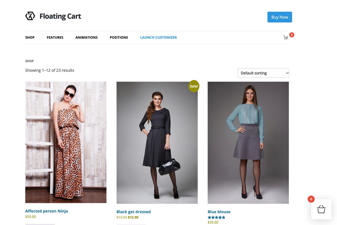
If checks 2, 5 and 6 turn up problems, a cart that opens on the same page can fix several at once. Our Floating Cart plugin lets customers add and remove items without leaving the page. Its product page lists a free shipping progress bar, coupons, upsell and cross-sell options, and a checkout form that doesn’t need a page reload, plus device visibility options so you can decide where the cart shows. If all you need is a spinner and a checkmark on the button, with a choice of redirecting to the cart, checkout or another page, Ajax Add To Cart is free. You don’t need either one to run this audit, since most checks here are settings and layout decisions.
Part 3: checkout
8. Can someone buy without an account?
Baymard found that 18% of shoppers who weren’t just browsing left because the site wanted them to create an account. WooCommerce has a guest checkout option under WooCommerce > Settings > Accounts & Privacy. If you want customer accounts, the same page has an account creation option for after checkout, which lets a shopper pay first and set a password later.
9. Count the fields
Baymard’s checkout research found that an ideal checkout can be as short as 12 to 14 form elements, while the average US checkout in its benchmark shows 23.48 by default. It also found that 17% of shoppers had abandoned an order because the checkout was too long or complicated.
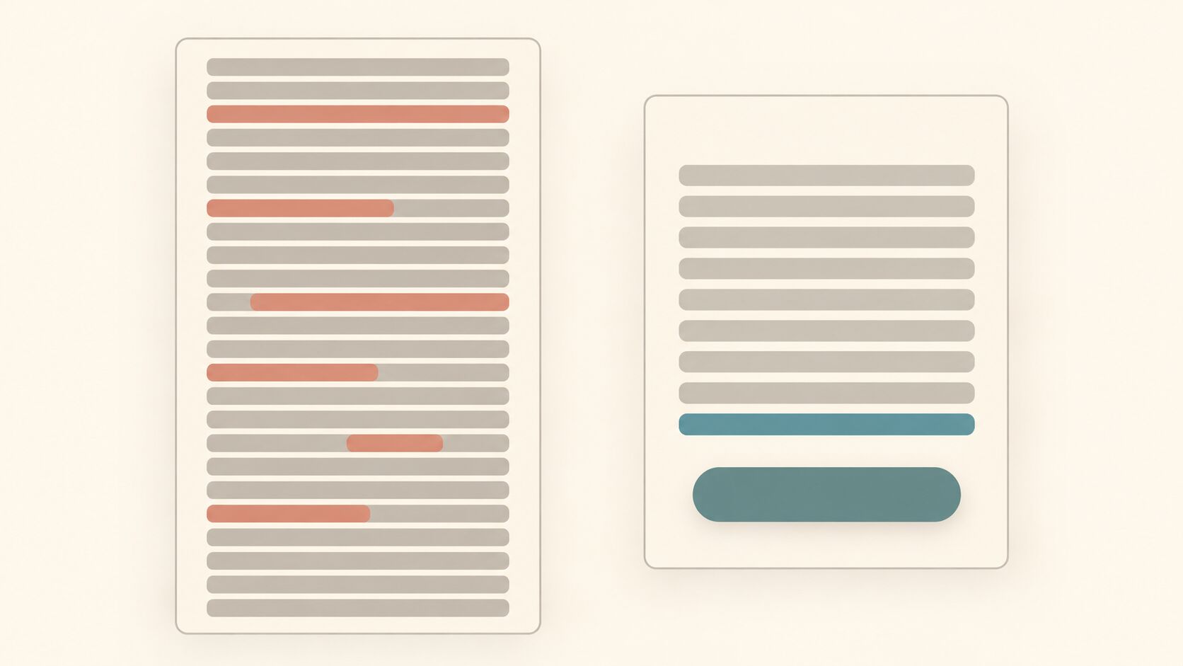
Count what your own checkout shows on a phone, then ask of each field whether you need it to bill and ship the order. Company name, a second address line, a phone number, and order notes are the usual candidates. Couriers sometimes need a phone number, so make that call for your own store. How you hide a field or make it optional depends on whether you use the Checkout block or the classic checkout, and on any checkout field plugin you have installed.
10. Do the right keyboards and autofill show up?
On a phone, typing is the slow part. The web.dev payment and address form guide recommends using the correct input type and autocomplete values, such as type="tel" for phone numbers, type="email" for email, autocomplete="address-line-1" for the street address, and cc-number for card numbers. For numbers that aren’t phone numbers, it suggests inputmode="numeric" to get a numeric keypad.
You don’t need to read your page source to test this. Tap the phone field and see whether a number pad appears. Tap the address field on a phone that has a saved address and see whether it offers to fill it in. The guide also suggests letting people enter their name in a single field unless you have a good reason to store name parts separately. Custom fields added by plugins are the most likely to be missing these attributes.
11. Is there a way to pay without typing?
WooCommerce’s documentation says the Checkout block’s Express Checkout section only shows if an active payment gateway supports express checkout, such as WooPay, Apple Pay or Google Pay. If your gateway offers a wallet button, make sure it’s switched on and that it appears at the top of the checkout on your phone. A shopper paying from a wallet can skip most of the form.
12. What happens when something goes wrong?
Break the form on purpose. Leave a required field empty, mistype the postcode, and use a test card that fails if your gateway has a test mode. Check that the error appears next to the field, that it’s readable, and that everything else the shopper typed is still there. Baymard lists website errors at 17% and declined cards at 10% of abandonment reasons, so this is worth a look.
Trust matters too, since 19% of those shoppers said they didn’t trust the site with their card details. Make sure the whole checkout runs over HTTPS and that shipping and returns information is easy to reach from the cart. Our complete guide to SSL explains what SSL is and why it matters.
What to fix first
Start with the issues that match the biggest reasons in Baymard’s list. Fix surprise costs (check 6) first, then forced accounts (check 8), then field count (check 9), then error handling (check 12). Tap targets, keyboards and the variation picker come after, because they’re usually quicker to fix and each one only trips up some shoppers.
Change one thing at a time, then run the same phone test again. Watch your checkout completion rate in your analytics for a few weeks before judging the result. A single day of data won’t tell you much.
If a cart that stays on the page sounds right for your store, the Floating Cart demo shows how it behaves, and Ajax Add To Cart costs nothing to try on a staging site.
